Tabs
A set of horizontally arranged buttons to switch between views.
import { Button } from "@/components/ui/button";
import { Input } from "@/components/ui/input";
import { Text } from "@/components/ui/text";
import React from "react";
import { View } from "react-native";
import {
Card,
CardContent,
CardDescription,
CardFooter,
CardHeader,
CardTitle,
} from '@/components/ui/card';
import { Tabs, TabsContent, TabsList, TabsTrigger } from "@/components/ui/tabs";
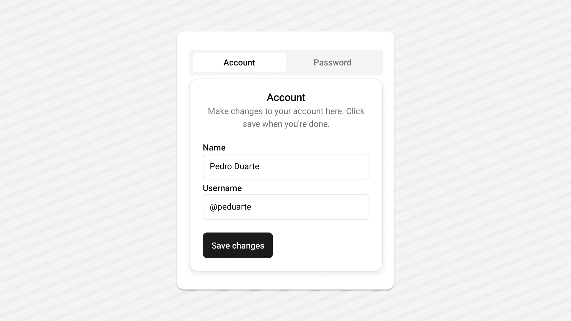
export default function TabsDemo() {
const [value, setValue] = React.useState("account");
return (
<View className="flex-1 flex-row justify-center items-center p-6 gap-5 bg-white">
<Tabs
value={value}
onValueChange={setValue}
className="w-full max-w-[400px] mx-auto flex-col gap-1.5"
>
<TabsList className="flex-row w-full">
<TabsTrigger value="account" className="flex-1">
<Text>Account</Text>
</TabsTrigger>
<TabsTrigger value="password" className="flex-1">
<Text>Password</Text>
</TabsTrigger>
</TabsList>
<TabsContent value="account">
<Card>
<CardHeader>
<CardTitle>Account</CardTitle>
<CardDescription>
Make changes to your account here. Click save when you're done.
</CardDescription>
</CardHeader>
<CardContent className="gap-4 native:gap-2">
<View className="gap-1">
<Text nativeID="name">Name</Text>
<Input
aria-aria-labelledby="name"
defaultValue="Pedro Duarte"
/>
</View>
<View className="gap-1">
<Text nativeID="username">Username</Text>
<Input id="username" defaultValue="@peduarte" />
</View>
</CardContent>
<CardFooter>
<Button>
<Text>Save changes</Text>
</Button>
</CardFooter>
</Card>
</TabsContent>
<TabsContent value="password">
<Card>
<CardHeader>
<CardTitle>Password</CardTitle>
<CardDescription>
Change your password here. After saving, you'll be logged out.
</CardDescription>
</CardHeader>
<CardContent className="gap-4 native:gap-2">
<View className="gap-1">
<Text nativeID="current">Current password</Text>
<Input
placeholder="********"
aria-Textledby="current"
secureTextEntry
/>
</View>
<View className="gap-1">
<Text nativeID="new">New password</Text>
<Input
placeholder="********"
aria-labelledby="new"
secureTextEntry
/>
</View>
</CardContent>
<CardFooter>
<Button>
<Text>Save password</Text>
</Button>
</CardFooter>
</Card>
</TabsContent>
</Tabs>
</View>
);
}Installation
npx shadcn@latest add tabsInstall the following dependencies:
npx expo install @rn-primitives/tabsCreate a folder named ui under component folder in your project and add the following code in a file named tabs.tsx:
import * as TabsPrimitive from '@rn-primitives/tabs';
import * as React from 'react';
import { TextClassContext } from '@/components/ui/text';
import { cn } from '@/lib/utils';

const Tabs = TabsPrimitive.Root;

function TabsList({
className,
...props
}: TabsPrimitive.ListProps & {
ref?: React.RefObject<TabsPrimitive.ListRef>;
}) {
return (
<TabsPrimitive.List
className={cn(
'web:inline-flex h-10 native:h-12 items-center justify-center rounded-md bg-muted p-1 native:px-1.5',
className
)}
{...props}
/>
);
}

function TabsTrigger({
className,
...props
}: TabsPrimitive.TriggerProps & {
ref?: React.RefObject<TabsPrimitive.TriggerRef>;
}) {
const { value } = TabsPrimitive.useRootContext();
return (
<TextClassContext.Provider
value={cn(
'text-sm native:text-base font-medium text-muted-foreground web:transition-all',
value === props.value && 'text-foreground'
)} >
<TabsPrimitive.Trigger
className={cn(
'inline-flex items-center justify-center shadow-none web:whitespace-nowrap rounded-md px-2 py-1.5 text-sm font-medium web:ring-offset-background web:transition-all web:focus-visible:outline-none web:focus-visible:ring-2 web:focus-visible:ring-ring web:focus-visible:ring-offset-2',
props.disabled && 'web:pointer-events-none opacity-50',
props.value === value && 'bg-background shadow-lg shadow-foreground/10',
className
)}
{...props}
/>
</TextClassContext.Provider>
);
}

function TabsContent({
className,
...props
}: TabsPrimitive.ContentProps & {
ref?: React.RefObject<TabsPrimitive.ContentRef>;
}) {
return (
<TabsPrimitive.Content
className={cn(
'web:ring-offset-background web:focus-visible:outline-none web:focus-visible:ring-2 web:focus-visible:ring-ring web:focus-visible:ring-offset-2',
className
)}
{...props}
/>
);
}

export { Tabs, TabsContent, TabsList, TabsTrigger };
This component depends on the Text component.
Please follow the installation guide here before using the Tabs.
Update the import paths to match your project setup.
Usage
import { Tabs, TabsContent, TabsList, TabsTrigger } from "@/components/ui/tabs";<Tabs
value={value}
onValueChange={setValue}
className="w-full max-w-[400px] mx-auto flex-col gap-1.5"
>
<TabsList className="flex-row w-full">
<TabsTrigger value="account" className="flex-1">
<Text>Account</Text>
</TabsTrigger>
<TabsTrigger value="password" className="flex-1">
<Text>Password</Text>
</TabsTrigger>
</TabsList>
<TabsContent value="account">
<Text>Make changes to your account here.</Text>
</TabsContent>
<TabsContent value="password">
<Text>Change your password here.</Text>
</TabsContent>
</Tabs>